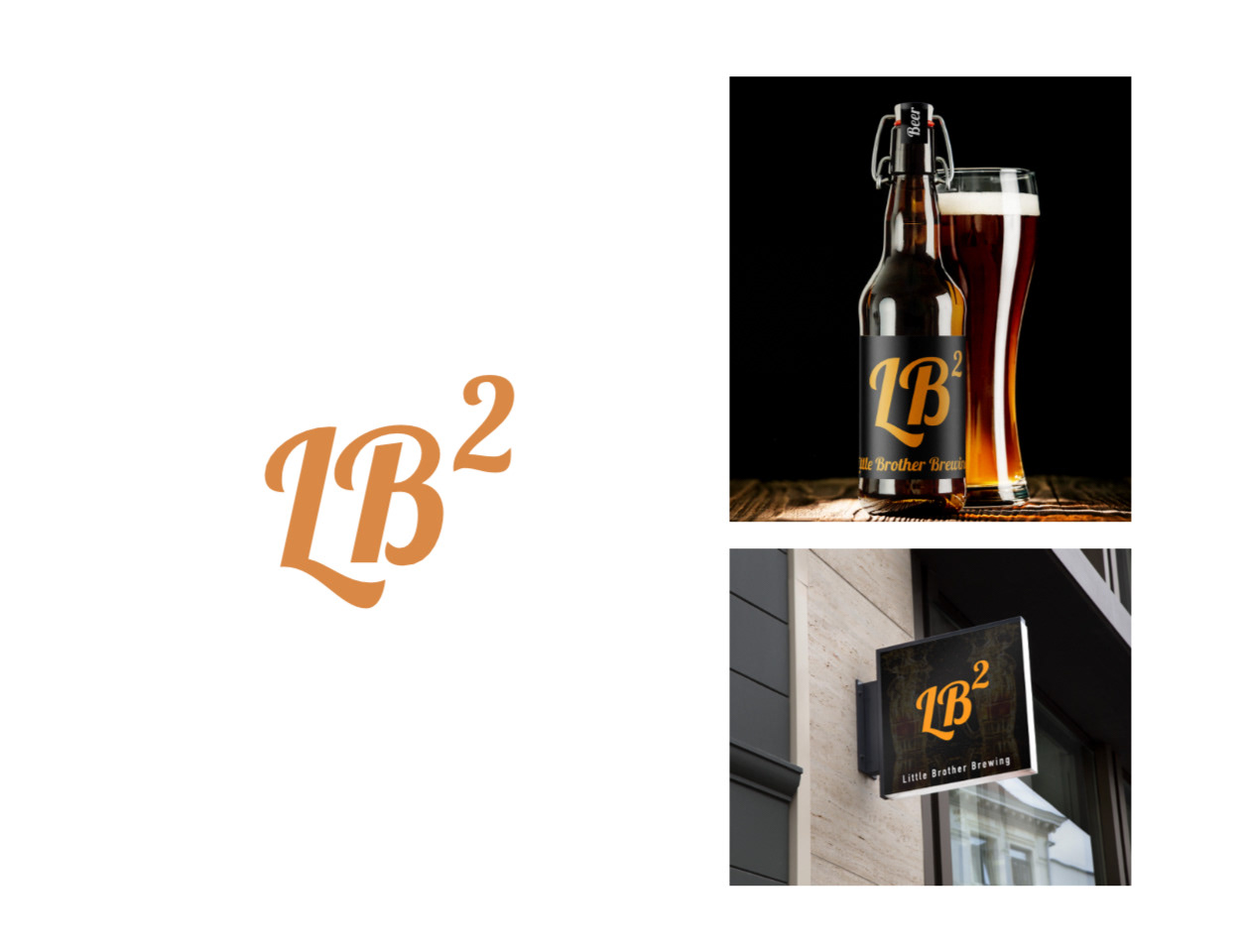
This redesign for Little Brother Brewing presents a bold and modernized brand identity that captures attention while maintaining a sense of cohesion across multiple platforms. The newly developed logo, “LB²,” the squared element positioned above the “B,” creates a unique and memorable visual mark. The updated color palette of orange and black introduces a striking contrast that conveys energy, creativity, and a contemporary edge. This new identity is effectively showcased through practical applications, including its placement on a bottle design and a digital wall sign mockup displayed outside a storefront.